You are here

IA's blog

Error message

  • Deprecated function: implode(): Passing glue string after array is deprecated. Swap the parameters in drupal_get_feeds() (line 394 of /home1/hubtoled/public_html/instone-org/includes/common.inc).
  • Deprecated function: The each() function is deprecated. This message will be suppressed on further calls in menu_set_active_trail() (line 2404 of /home1/hubtoled/public_html/instone-org/includes/menu.inc).

Information architecture hat

This blog is when I have my IA hat on: navigation, wireframes, taxonomies, content management and other "down in the trenches" work.

RSS feed of only my Information Architect blog


Reframing IA at IA Summit

I am looking forward to the IA Summit next week. My 13th, out of 14. Mostly going to catch-up with colleagues, learn, sight-see with the family, and talk about business opportunities.

And I will be participating in the Reframe IA workshop. There will be many people smarter than me there who will talk about better framings for IA. My interest is more about the process of reframing and how to close aspects of the research-practice gap. I have been "studying" the problems and solutions with user experience research practice interaction (#UXRPI) and this is another attempt at making progress.

I have posted my slides for the workshop on SlideShare in case you want to take a peek.

I am not really sure what my talking points will be for each slide: going to wing it. It is "round table workshop" so it will be all about the discussion.

Blog topics: 

IA Summit 2011

I am missing my first IA Summit, after making it to the first 11.

I can get some value from the conference remotely.

  • I am definitely following #ias11 on Twitter. It will get crazy soon, as the Saturday sessions kick off and people are tweeting from up to 4 sessions at the same time.
  • I also plan on tweeting with attendees, asking them questions and sometimes even participating in online discussions that stem from what happens face-to-face.
  • Decks are being posted to SlideShare. Some people won't post until after the event, which makes sense, so this will become more useful over the next few weeks. Martin Belam is also maintaining a list of slides.
  • The conference CrowdVine instance has some activity.
  • Some pictures are being posted to Flickr with the ias11 tag.
  • The Facebook event is pretty quiet.

I have not found anyone who has written a recap of Day 1. Or who is planning on doing "trip reports" from the event. Everyone is too engaged there, I completely understand.

If you find some other way to participate remotely in this great conference, let me know!

Google search results to include breadcrumbs (again)

A recent Biznology article by Frank Reed talks about the impact of a Google search results change on search engine optimization efforts. Google recently announced two changes in the way it helps users understand how an item in its result set fits into the context of the destination site:

  • Replacing the URL (that appeared after the abstract) with a breadcrumb. The breadcrumb is a combination of domain name and the site hierarchy that Google has extracted from the site.
  • Having each element of the breadcrumb go to the appropriate high level section of the site. What was once a single URL (was it a link or just a URL?) to the page could now be several links to higher-level pages on the destination site.

Frank worries about how this affects SEO activities: you work hard to get a specific page listed for a specific search term, and then Google lets the user go to a different page on your site. It will be interesting to see how this shakes out.

Of course, I am more interested in the breadcrumb aspect. These are what I call "attribute breadcrumbs" because they help describe the nature of the object. (The debate about the value of location breadcrumbs on pages continues.)

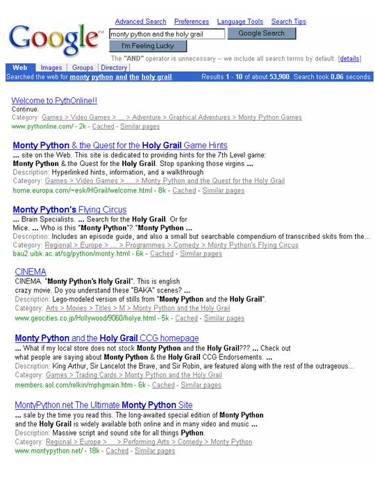
I wonder if anyone on the Google team remembers back around 2002 when their results also had breadcrumbs? In those days, the breadcrumb was a "category" from the Open directory project. Here is an example I grabbed back then, for a search on "monty python and the holy grail":

Look for the "Category" links after the abstracts and before the green URL. They give you a clue to what the link is about. Notice the first result, for PythOnline: the title and abstract are not clear but the Category says it is about a video game. The 3rd result is actually about Flying Circus; the 4th result is indeed about the movie; the 5th, trading cards. The category, presented as a breadcrumb, might help you find your holy grail...

Back then, the "category" was a single link to ODP, not a list of links to the destination site. For example, the 4th result would be Arts > Movies > Titles > M > Monty Python and the Holy Grail where you can find more links about the movie.

Will this version of breadcrumbs survive longer? Does it fix some key problem the previous version of breadcrumbs had? Perhaps users are more familiar with presenting a hierarchy in this format now? Will users understand the "..." in the middle? What user research is driving this change? The Google blog posting says this will both improve the way it represents web sites and help users explore content. I guess time will tell.

And what will the ripple effect be of Google using attribute breadcrumbs on its search engine results page (SERP)? Will more sites start doing breadcrumbs as a result ("Google told us to add breadcrumbs to our site")? What about multi-faceted web sites that do not have a single hierarchy for their pages: will they be penalized by Google? Will users start to pick up on them on SERPs and expect them on the rest of the web? When user experience teams do evaluations of their web sites, will they notice more users making comments about breadcrumbs? Will sites built on platforms like Drupal that do breadcrumbs well see a boost in traffic? Will there be a backlash against bothering with carefully-crafted URLs if they do not show up on SERPs any more?

This new feature has not appeared on any normal Google searches I have done since the announcement, so obviously, it is still too early to tell. According to This week in search, 11/20, there are some queries where the attribute breadcrumbs are showing up. My favorite is Venn diagram (too funny given the number of 3 circle diagrams generated by the user experience community). What I notice:

  • Only a few items have breadcrumbs instead of URLs.
  • When the green URL is shown, it is never clickable (was it before?). When an attribute breadcrumb is shown, the domain name is not a link either.
  • The most interesting example is Wolfram MathWorld where the site has three location breadcrumbs at the top and Google used the first. Exactly how Google extracts breadcrumbs from pages could drive some "interesting" changes to sites.
Blog topics: 

UX+IA workshop: Toronto, June 2008

In the better-late-than-never category, let me tell you about something I did last summer. In June, we took a family vacation to Toronto: while there, I did a TorCHI talk, and helped lead a "hands-on" workshop about information architecture. It is that workshop that I never got around to mentioning here.

The original TorCHI call for participation gives a good overview of what we set out to do. Paul McInerney, my co-collaborator who talked me into doing this and did at least as much work as I did, if not more, came up with this recap of the topics we actually covered:

  • Site sections: When to use, types, navigation design within and between site sections. Case study: Large IT vendors, specifically ibm.com.
  • Role based IA: Defining suitable roles, designing the top level categories and navigation based on the roles, if and when to use a role-based approach. Case study: City government sites, including Toronto and others that have contrasting approaches.
  • Wireframes: Challenges and best practices using wireframes, such as fidelity, ownership, expectations, tools, Agile methods. Case study: Examples provided by participants.
  • Putting it all together: A holistic discussion of web site issues, including those covered in the prior sessions. Case study: Transit authority web site.

We divided the day up into 1.5 hour sessions, with breaks and a nice, long lunch. So it made for an intense but very rewarding day.

Some of the key aspects of this workshop (that I think made it better than whatever might be considered the "usual"):

  • Making it activity-based, not lecture-based. Learning is more fun when you are doing it, not just listening to it. I have to admit that I started out too lecture-y at the beginning of the workshop day, but by the end, the participants were "leading by doing" and I was just sitting back and advising more.
  • Tackling some of the thornier issues in information architecture, like task-based and role-based organizational schemes. I know, "role-based IA does not work" is the surface-level response, but we wanted to dig deeper to really understand why it does not work - and perhaps, even, discover some situations when it does.
  • Adjusting the topics based on what the attendees wanted to talk about. "Wireframes" was not something I had in mind initially, but each participant submitted a list of "burning issues," we voted and wireframes came up to the top. (Note: Chapter 10 of Communicating Design was required reading for this topic.)
  • We had experienced people attend, and capped it at about 10. I love teaching the basics to newcomers, but this was about "doing advanced IA" with peers in a close-knit setting. I am sure the participants learned more from each other than they learned from me.
  • Using common, local scenarios to "make it real." We were in Toronto, so we gravitated towards Toronto-area local government and transit authority examples.
  • Preparing each section in detail, with "learning goals," "preparation materials" (aka "homework to do before the workshop") and "exercises." It was a lot of work to prepare, and it took some commitment from the participants. We did not always stick to the master plan, but it was good to map out the day in gory detail so that we could decide as a group when the flow of the day was pushing us in a better direction.
  • A "putting it all together" session at the end of the day. We debated whether this would work, or whether we should just have a 4th deep topic. This was my favorite part: I did see people incorporating the sub-site, task and role IA issues from earlier in the day into the holistic user experience session at the end.

I really enjoyed it, and the feedback I got from the participants indicated they liked it too. It was worth their time and money, it seems. What prompted me to write this summary is that Paul/TorCHI are going to try it again. Check out the UX Irregulars post for some initial information.

If you are an IA in the Toronto area, I definitely encourage you to sign up to get more information about the 2009 version. While I am glad I did it last year, I am more glad to give someone else a chance to lead it this year (too darn busy). I think we showed that the basic idea of "a hands-on workshop for experienced practitioners to tackle deep problems" is sound. Now someone else can work on perfecting it.

ASIS&T meeting impressions

Last month I attended the ASIS&T 2008 annual meeting. I have attended all of the IA Summits (also by ASIS&T) but this was my first "annual meeting." I typed up some notes during the conference, but wanted to wait to compose my thoughts and reflect a little longer. Here ya go.

Highlights for me:

  • I liked spending time with colleagues that I have not seen in years. Like: Gary Marchionini and Cathy Marshall, to name just a few. I caught up on their research, they caught up on the challenges for my job.
  • I got some IBM work done, meeting David Millen and connecting some of his research to ibm.com initiatives. It still pays to find IBMers by going to (outside) conferences.
  • Both plenary sessions helped me think outside my ibm.com box and see how the rest of the world is using the Internet these days. For example, the Digital Youth Project report has now been officially released. Check it out.
  • Strengthened/made local connections, such as old colleagues at IAKM and LexisNexis, new ones at OCLC and Wayne State.

So, net, it was worth attending, for sure. Any time I can drive a few hours and hang out with fellow user experience professionals who have traveled here from around the world, I will be there. I do all I can to support UX-related gatherings in the midwest.

What I found really interesting about the event (neither good nor bad, just different), were the elements that made it a meeting first and a conference second. When I compare it with other professional association annual gatherings that I have been to (like the CHI conference by SIGCHI and UPA's conference), then I notice some things that stand out here:

  • Business and committee meetings, special interest group planning and other things to "do the business of ASIS&T". These things happen at "conferences" too but they were more prominent here.
  • The "intellectually stimulating" content (the conference part) is driven by the ASIS&T org chart. Special interest groups, in this case, sponsor the panels, seminars, etc. In other association events, I think the sessions are more driven by individuals, not "each SIG organizes their own track".
  • Lots of fellowship, awards and recognitions. Since this was my first ASIS&T meeting, it sort of felt like my first big reunion with my wife's extended family. I only knew a subset of people, I did not get all of the inside jokes or the personalities, but everyone was very welcoming and wanted me to come back for next year's get-together.

I can see how this type of annual event builds up loyalty. Come to one meeting and you could get "hooked", volunteering for all sorts of worthwhile ASIS&T activities for the next 12 months. You will almost have to attend the following year.

The meeting-focus does provide some challenges for the "technical program" side of the event, however. There is a lot of competition for compelling conference content, and when people ask me "where can I go to really stretch my brain for a week?" then it will be hard to recommend this conference over the many other choices. Making the conference sessions better would also help draw in some "outsiders" (non members), which would hopefully lead to some getting "hooked", and so on.

Which leads me to my only real complaint about the conference. To be blunt: There were too many academics on stage talking for too long. There were not enough researchers from companies on the panels. There were not enough practitioners giving their views. Most sessions did not leave enough time for audience questions and conversations.

I really do not hate academics - I love them, actually. I knew this would meeting would be research and academic focused, I was looking forward to that aspect. I had some great conversations with professors and students (at the SIGUSE symposium, in the hallways, at lunch and at the poster sessions.) But it was too unbalanced for me. If you know me, you know I do not bitch that often, and I only do it because I care and I want to make things better. So let me offer these suggestions for future technical sessions at the annual meeting:

  • Each research-oriented panel must have at least 1 member who does not work at a university. A researcher from IBM, Microsoft, some other organization, who talks about the topic from their company's point of view.
  • Each panel must have at least 1 practitioner to act as a sounding board. "I hear what you are saying and here is how I deal with it in my world" sort of thing. Get more practitioners up on stage.
  • Encourage people to follow "best practices" for presenting. Like: more pictures and less text on slides. Take "clarification" questions during their talk and leave lots of time for discussion after. Provide an overview (only) up front and leave the details for Q&A (so if no one cares about your details, we do not have to hear them).
  • When a student is presenting their research, do not allow their advisor on stage. The advisor can only help answer questions after the student has done their best. I do not mind going to a session where students are presenting their work, but I want the students thinking on their feet and answering questions, I do not want their professors explaining things for them.

The research/practitioner divide was exacerbated for me because of the gap between the SIG Information Architecture community and the ASIS&T membership as a whole. That fracture runs deep and goes beyond the ASIS&T annual meeting, so I do not want to get into it here. Those things will get addressed.
Blog topics: 

Day 1 IA Summit notes

Brief and rough notes from the Saturday IA Summit sessions.

Jared Spool, UCD "rocks" but not in the way that you think

  • Good but quite different from the usual Jared talk; definitely more pontification, less on practicality and not as hilarious. If Jared keeps this up, he will start to rival Jakob for making over-simplistic statements that are partly true but can be really misinterpreted if not looked at with a critical eye.
  • I do agree with Jared that the world we work in has changed a lot since the IBM/360 (which I programmed in high school). "User-centered" was needed to combat the other forces "in the good old days" (that were not that good). If you were blindly following a UCD methodology in the past, you were doing bad UCD to begin with. If you are blindly following any methodology you are doing bad work to begin with.
  • I think what we do today is more about collaboration than the "put my discipline in the center of the process" battles from the old days. Collaboration with other professionals in the UX realm, collaboration with business, collaboration with development. And so on.
  • Human bar charts: stroke of genius.
  • Informing design is important but do not forget about another value of focusing on the user experience: the more strategic impacts of determining what to design in the first place.

Gene Smith, Tagging trends

  • General trend: adding more structure to user-driven tagging. Sub trends: Automanual tagging, community-driven structuring.
  • User + resource + tags model needs to be expanded now. Tags are being applied to the resource as a whole but also parts of the resource.
  • "Innovative" systems being built upon tagging. IBM Dogear referenced.

Tingting Jiang, Exploratory search and folksonomy

  • An entry in the mythical "research track".
  • Compared hierarchical classification, faceted classification, dynamic clusters, folksonomy.
  • Four user activities: Browse, search, being aware, monitoring.
  • User + resource + tags model with lines showing what the systems are doing. Resource-to-resource is a dotted line (no one doing it, apparently).

Bryce Glass, Reputation systems

  • Patterns: Levels, points, Top, Trophies, Ranking, Awards, Stats, Testinomials. Coming soon to Yahoo! Design Pattern Library.
  • More interesting (to me): The questions to ask the business to see what reputation system aspects are right for them.
  • Business goals? Community spirit? Member motivation? Measuring reputation? Inputs to the reputation? Etc.

Jess McMullin, Experience impact framework

  • How to work with your stakeholders better.
  • Know who they are (e.g., 8 types of people).
  • Know what motivates them.
  • Know what they do, their activities.
  • "Do what we do" in collaboration with them. Understand, solve and evaluate with them.
  • Get commitment to action.

Brandon Schauer, Wow factor

  • Business goal is customer loyalty: accomplish with "wow factors" within the experience.
  • People remember the high, the low and the end of the experience. "Total sum" that can stress the "average" not as important.
  • Build experience roadmaps to show how it all fits together, evolves over time, crosses channels.
  • Planning the experience and staging the experience, not just designing the experience.

IA Summit sessions

I just reviewed the IA Summit 2008 sessions and updated the list of what I want to attend. I am sure what I attend will be different for several reasons: getting caught up in a great conversation in the hall and missing a session, doing the "divide and conquer" with my ibm.com colleagues, or just changing my mind at the last minute.

A few trends / hi-lites / random thoughts:

  • Both keynotes are by "insiders" - Jared Spool and Andrew Hinton. Usually one of the keynotes is an "outsider" - and thus usually one of my favorite sessions. I am sure both keynotes will be awesome anyway.
  • This morning: back to back sessions on tagging (by Gene Smith, probably based on his new book) / tag clouds (by Garrick Schmitt).
  • Two chances to hear Peter Morville on Search patterns. I may alter my schedule to make sure I catch him the second time - there should be fewer people there and he will have the kinks worked out (but he may be grumpier).
  • Definitely not going to miss Jess McMullin and business + experience.
  • Sunday morning at 9am is a real downer: I need/want to go to all 3 sessions. Game experience vs. Taxonomy/UX vs. Placemaking.
  • Good to see a service design session, by Aaron Martlage (who I met at Emergence 2007). We need more service design / UX cross-over.
  • I may miss half of the sessions on Monday because of meetings. The sessions on Monday look good, but fortunately my "must attends" are all on the weekend.
  • In the past there has been a "research track" even if it was not called out as such. Is there one this time?

And start planning for next year - Memphis, February 18-22, 2009 - only 10 short months away.....

The Information Architect as Change Agent

Matthew Clarke has a new article on Boxes and Arrows about The Information Architect as Change Agent. I have not read it carefully yet (too early in the morning), but I added a comment about how I have come to many of the same conclusions through my "innovation and change" investigation.

Blog topics: 

Breadcrumb Navigation Increasingly Useful

I do not regularly read Alertbox any more, but this one was too good to pass up.

People often think that when I defined different types of breadcrumbs that I automatically thought "path breadcrumbs" were a good idea or that I was advocating that breadcrumbs as a whole were mandatory. Not so - I simply wanted to define the various types so that information architects (and others) could talk about breadcrumbs intelligently.

Jakob, of course, goes farther, saying location breadcrumbs are the way to go and they are worth doing.

Blog topics: 

Pages

Subscribe to RSS - IA's blog